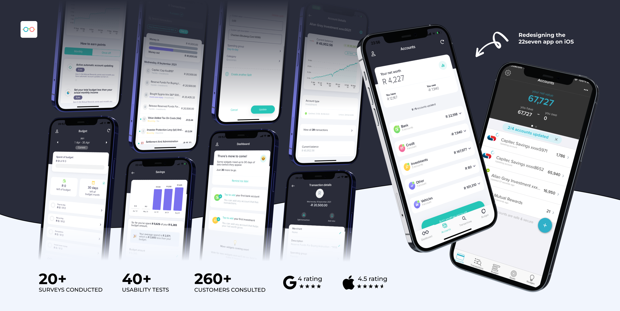
Project overview
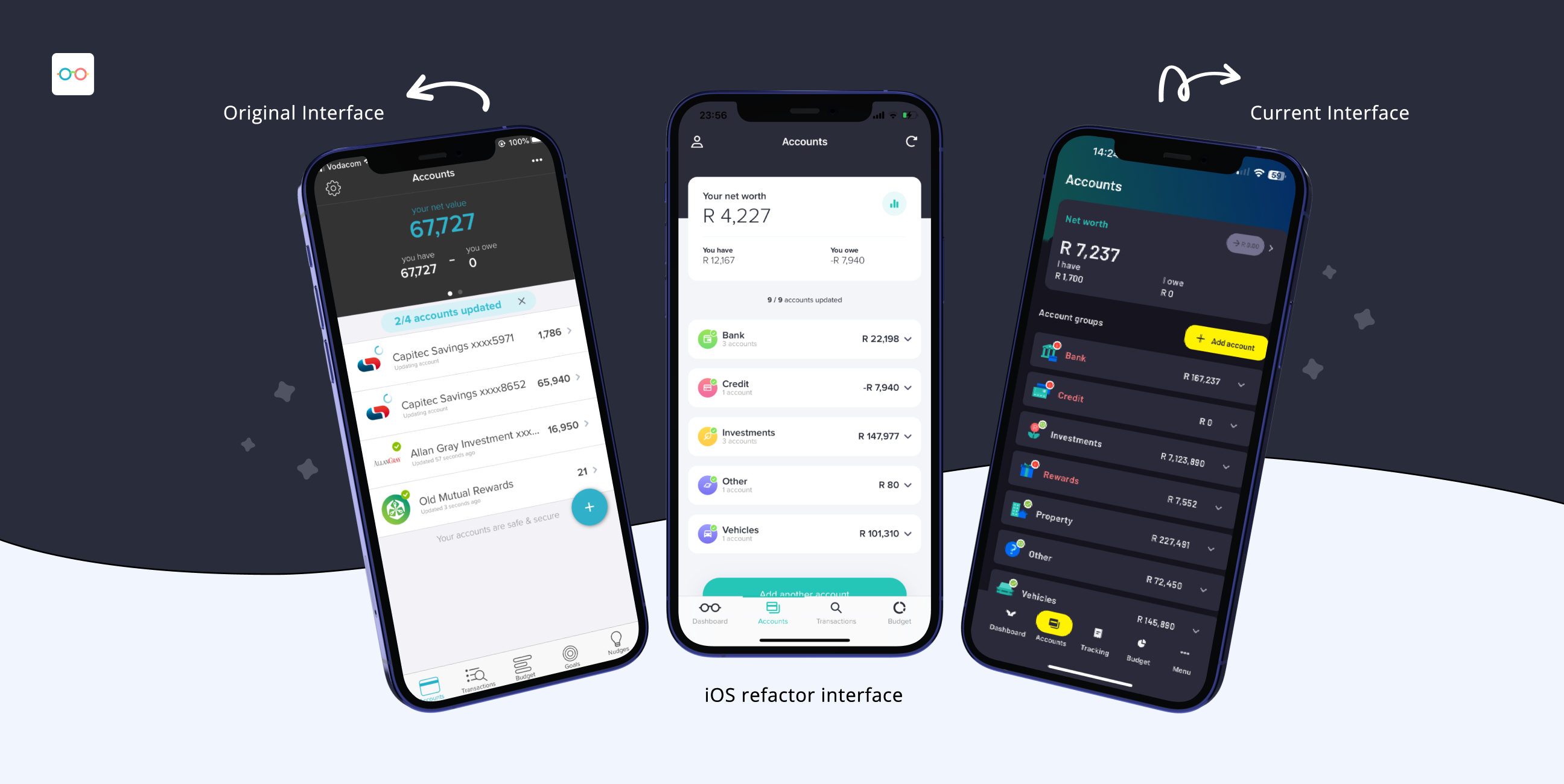
22seven is a budgeting and money management app that helps users track their spending and understand their finances more clearly. When the original iOS app was approaching expiration on the App Store, the team faced a critical decision: rebuild the old app with updated code, or take the opportunity to rethink the experience entirely. We chose the latter.
This decision unlocked a chance to reimagine 22seven for iOS—not just from a technical standpoint, but also in terms of usability, feature set, and visual language. Rather than replicate the original experience, we used the rebuild as a testbed for improving key features and introducing entirely new ones. Our aim was to deliver a faster, more delightful experience while laying the groundwork for innovation—starting with a completely refreshed design system, optimised flows, and a new dashboard-style home screen with interactive widgets.
The Problem/Challenge
With the iOS version of 22seven approaching its App Store expiry deadline, we had less than a year to design, develop, and ship a completely rebuilt app. Recreating the existing app was one option—but instead, we saw it as a chance to make it better. The challenge? A small team of just two: one designer (myself) and one dedicated front-end developer (Byron).
We needed to identify the essential features required for launch, while balancing performance, design, and user expectations. In parallel, we collaborated closely with our support team to understand recurring usability pain points, allowing us to subtly evolve key flows without disorienting long-time users.
Since the original app had no formal design system, we had to create one from the ground up—ensuring visual consistency and scalable UI components for future development. We also engaged our user community via a public Jira board where they could vote on "nice-to-have" features, ensuring transparency and inclusion in the development process.
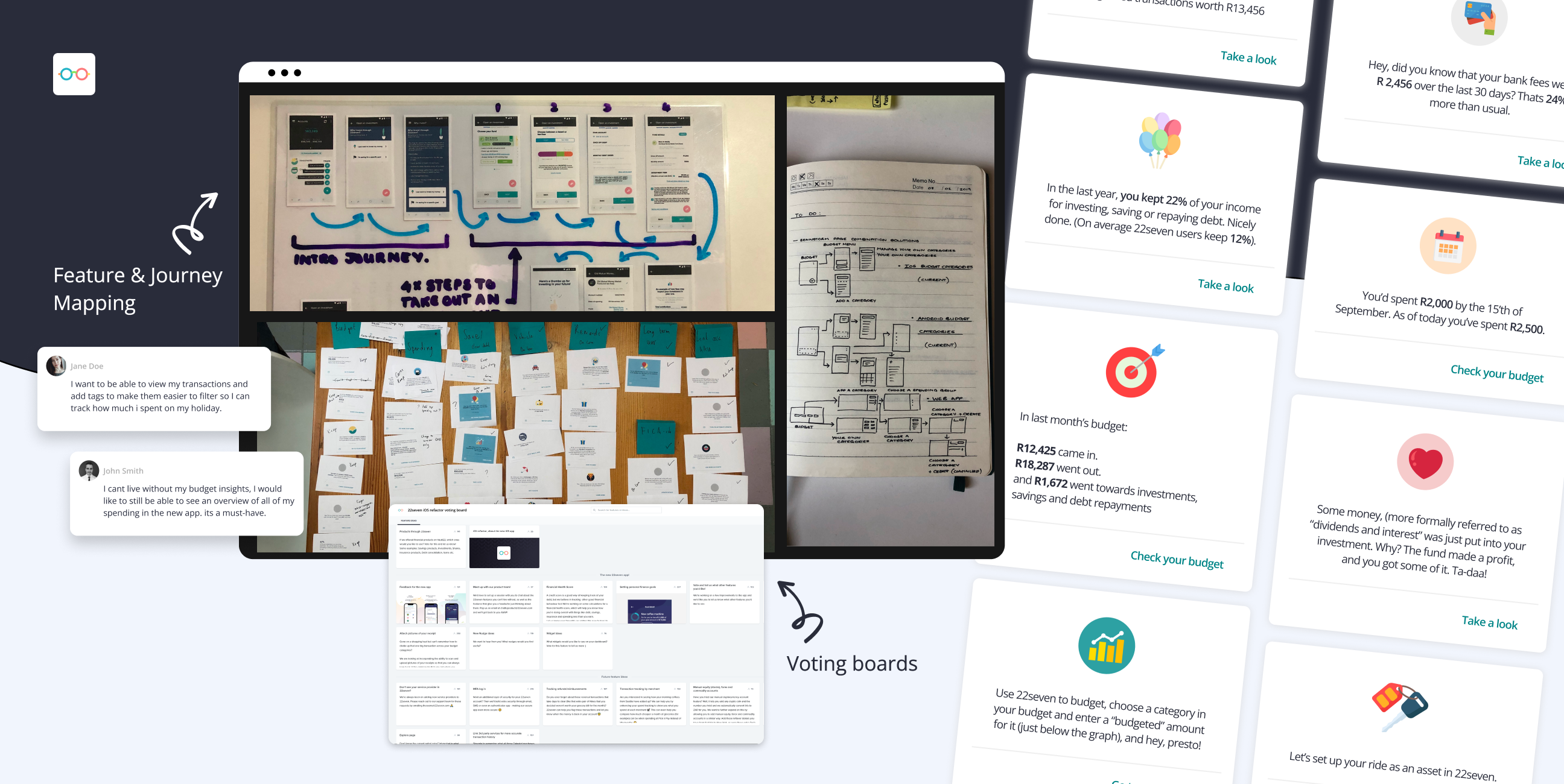
Research & Discovery
User involvement was central to our approach at 22seven. From the start, we invited our community into the development process through multiple research channels—ensuring the new iOS app wasn’t just rebuilt, but meaningfully improved.
Our research methods included:
- Jira feature voting:
Users could vote on features via our public Jira board, helping us distinguish between essential and “nice-to-have” functionality. - Weekly user testing:
We conducted one-on-one sessions every Tuesday, testing and iterating on new flows or features still in the design phase. - Surveys via email campaigns:
Google Forms were distributed through our mailing list to gather qualitative feedback on proposed features or changes. - Useberry task analysis:
We tracked click patterns, hotspots, and user flows to assess ease of use and identify areas of friction. - Internal dogfooding:
The team used the app internally ahead of launch to iron out bugs and friction points in a real-world context. - Closed beta testing:
We invited a small group of highly engaged users to test the app before its public release and provide direct feedback. - WhatsApp testing community:
We built such an engaged testing community via WhatsApp that we eventually had to split it into two groups—allowing us to run A/B tests and gather fast, informal feedback in real time. - Competitive research:
We analysed apps like YNAB and Mint, and even studied how users structure their budgets in Excel to align our product with real-life financial behaviours and expectations.
Strategy & Process
With limited time and a lean team, we established a clear product strategy focused on speed, prioritisation, and continuous learning. Our process was both structured and adaptable, designed to keep momentum without sacrificing quality.
- MVP-First Mindset
We identified and prioritised the core features essential for the app to function: account linking, transaction viewing, categorisation, and budgeting. Non-critical features (like vehicle valuations or historical reports) were deferred for future releases, keeping the scope manageable and focused on delivering core value. - Prioritisation Framework
We involved users in prioritisation using:- A public Jira board where users could vote on “nice-to-have” features
- Direct feedback via WhatsApp testing groups (which eventually became large enough for A/B testing)
- Ongoing input from our support team, who surfaced real-world user frustrations and pain points
- Agile Execution
We worked in two-week sprints and operated in one of the most well-oiled Agile environments I’ve experienced. Daily standups included all disciplines—from devs to designers to call centre agents—ensuring visibility and alignment across the board. - Cross-Disciplinary Collaboration
- Designers used Trello, while developers used Jira, but we stayed in sync through constant communication.
- As the sole designer on the project, I collaborated closely with Byron (our front-end dev) to assess design feasibility, align on complexity, and reduce unnecessary dev overhead.
- Tooling & Flexibility
We adopted Figma as soon as it launched—recommended by a dev—and it became central to our collaboration. The team had a culture of experimentation and welcomed new tools that improved speed and efficiency. - Design-to-Dev Handoff
Once designs were finalised, they were added to the dev backlog in priority order. If needed, we reprioritised based on capacity or shifting needs. Every feature passed through design QA to ensure fidelity to the system and usability standards before development sign-off.
Our strategy enabled us to meet tough deadlines while still improving the user experience and growing the product with intention. It was a true balance of fast decision-making, thoughtful prioritisation, and user-led refinement.
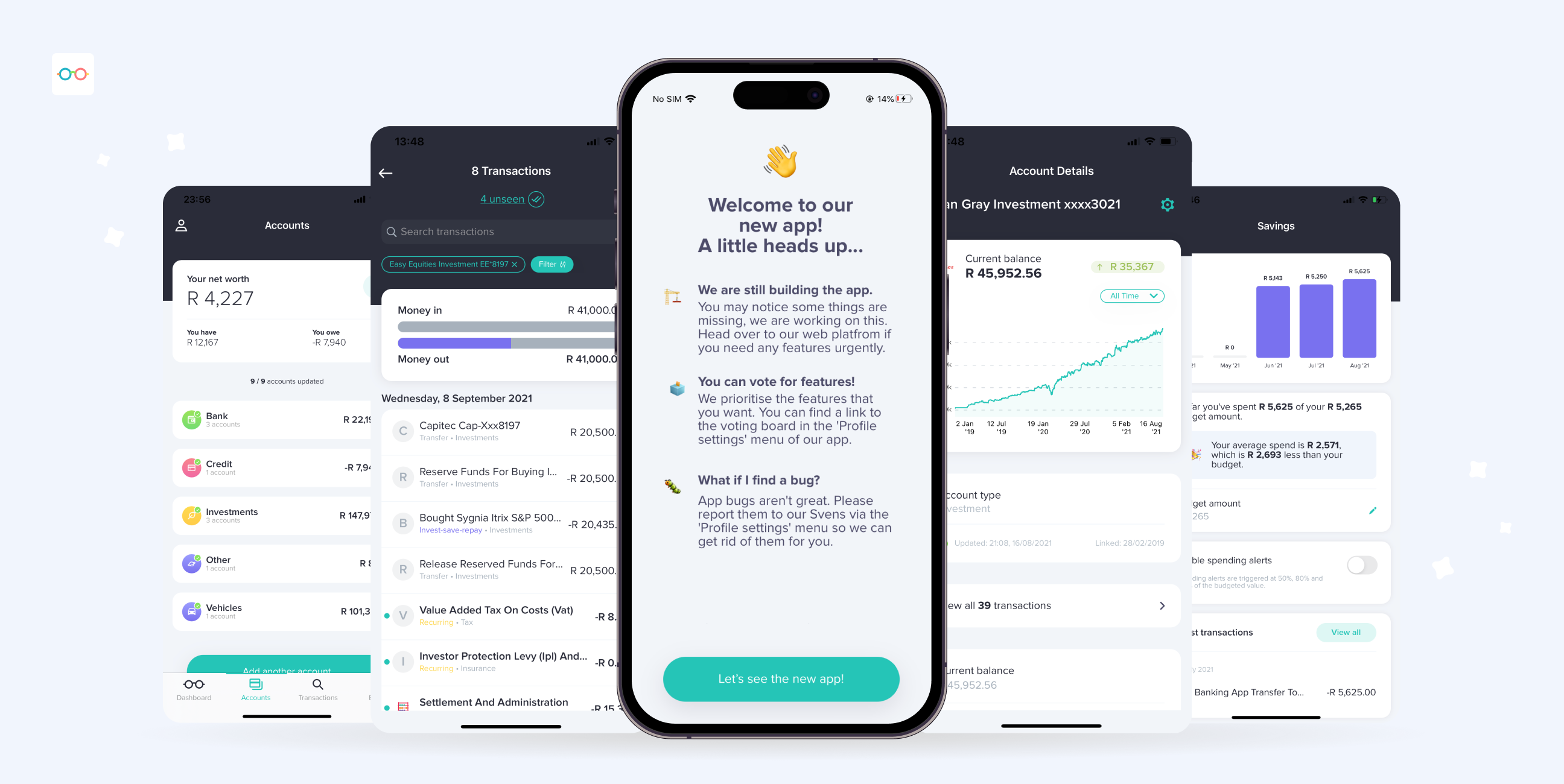
Design & Iteration
We followed a lean, iterative design approach rooted in collaboration, speed, and user needs. Given our small team and tight timeline, we optimised every step of the process to balance craft and practicality.
- Pattern Research & Feature Analysis
When working on a new feature, I began with pattern research—reviewing what competitors were doing, assessing our own legacy patterns, and identifying usability issues through conversations with the support team. This gave me a solid foundation for what users expected and where we could improve. - Collaborative Design
While designing, I worked closely with our front-end developer to validate the technical feasibility of ideas. We considered the dev lift of each feature versus its user impact and made decisions together that helped avoid unnecessary technical overhead. - Fast, Focused Iteration
Designs were developed and refined through multiple feedback loops, including weekly usability testing, team input, and internal beta usage. We used Figma from its early days, taking full advantage of its collaboration features to iterate quickly and maintain clarity across teams. - Modular, Simple Design System
This was my first time building a design system from scratch. With support from experienced teammates, we followed a “keep it simple, fail fast” mentality. Our modular approach allowed us to scale and update quickly, using components like drawers for focused, single-task flows rather than full-screen transitions. This not only simplified development but made interactions more efficient for users. - Design QA Process
Every feature had to pass a strict design QA before being shipped. I personally reviewed all builds to ensure alignment with the design system and specs, checking:- Layouts, typography, and spacing
- Consistency in interactions
- Responsiveness across devices
- Usability edge cases and accessibility
We refined any discrepancies with the developer before release to ensure a polished, reliable experience.
This focused and flexible approach helped us ship a high-quality iOS app that felt cohesive, intuitive, and aligned with user needs—despite limited resources.
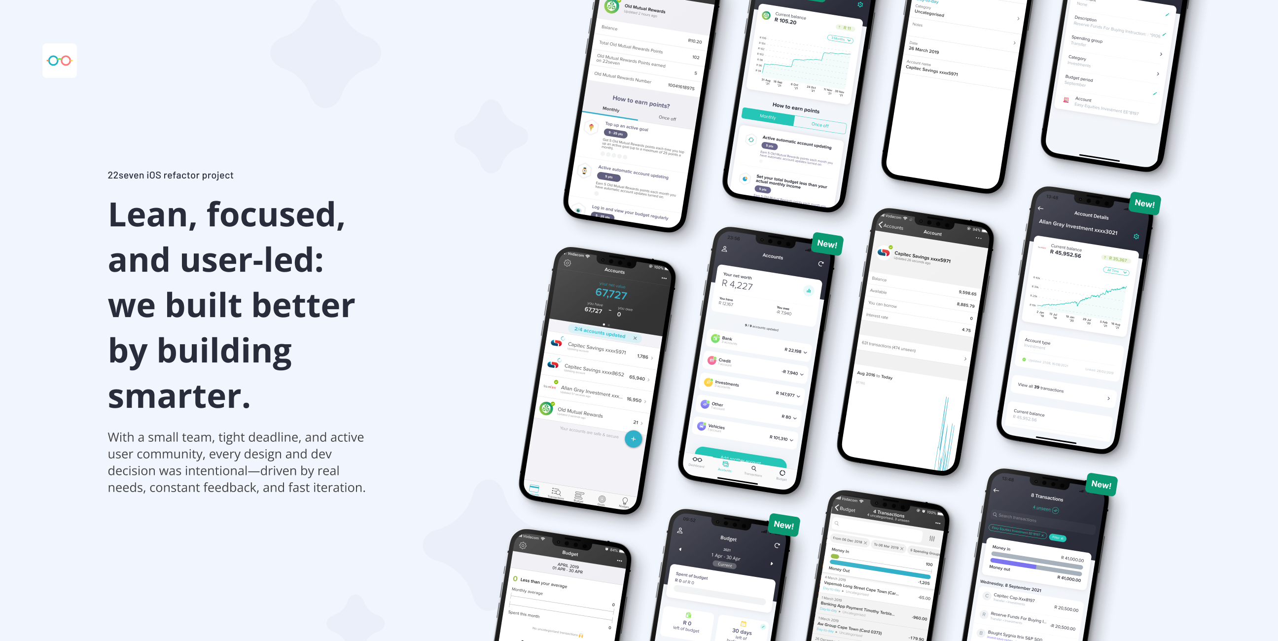
Final outcome & Results
We successfully met the critical app expiry deadline—delivering a completely rebuilt iOS app that not only preserved the core 22seven experience but meaningfully improved it. Despite a small team and tight timeline, we were able to:
- Meet the release target comfortably, thanks to lean planning, iterative delivery, and close collaboration across disciplines and stakeholders.
- Increase daily active users by 60% post-launch, showing improved engagement with the platform.
- Maintain and build on existing momentum, with monthly downloads and account linking continuing their strong upward trend.
Perhaps most telling of the project’s long-term impact:
Even after 22seven was acquired and shifted to a hybrid app ecosystem, the new owners retained the design system, components, and UX foundation we created. Aside from updated colours and a few minor UI tweaks (like icons) and a change in name/branding, the experience remains largely the same—testament to the durability and value of the redesign.
This project not only met its goals but set a scalable design foundation that lives on well beyond its original scope.